Hi there! For those of you who don’t know me, my name is Roan de Vries. I’m 18 years of age and I’m studying music in The Netherlands. I think you can guess my hobby by now, which is making music in general, but specifically playing the guitar. Most of you probably never heard of me, but you may have heard about my dad: Remkus de Vries.
My experience so far in WordPress has been very limited, but I have been to my first WordCamp recently in Antwerp. I’m very keen to learn more about WordPress.
My dad pointed me to an article about improving the WordPress New User Experience by creating a more beginning user friendly environment. As I was reading it made me curious how I would perform on those tasks. I thought I’d do my share and give a look inside my head on how I complete a set of four very beginner tasks (as shown in the article).
Task 1
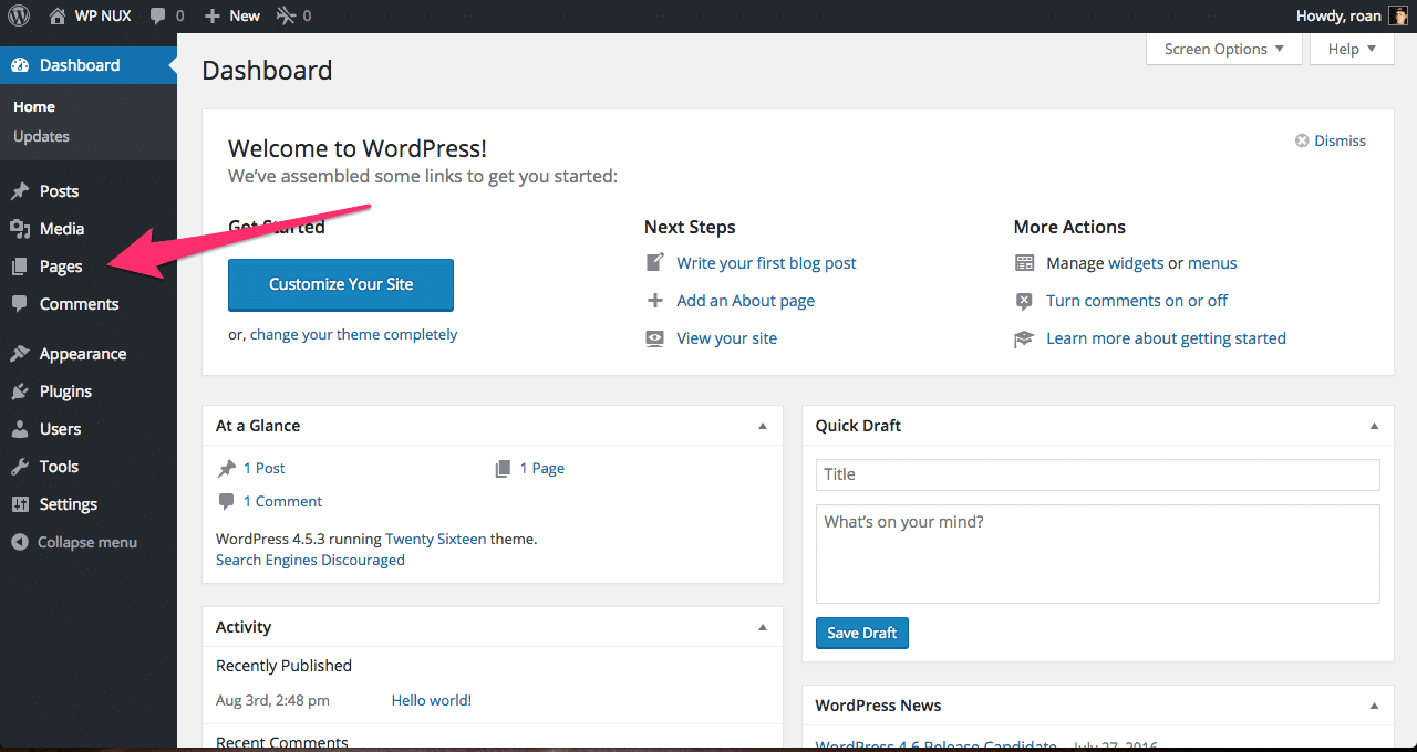
The first task is to add a page to my website, with one paragraph of text, and upload two images. So that’s what I’ll be doing first. First I will have to go to make a new page so I will search for anything that says pages in menu I’m seeing. When I found the label pages on the left I click and see that I can add a new page and click the Add New Page button.
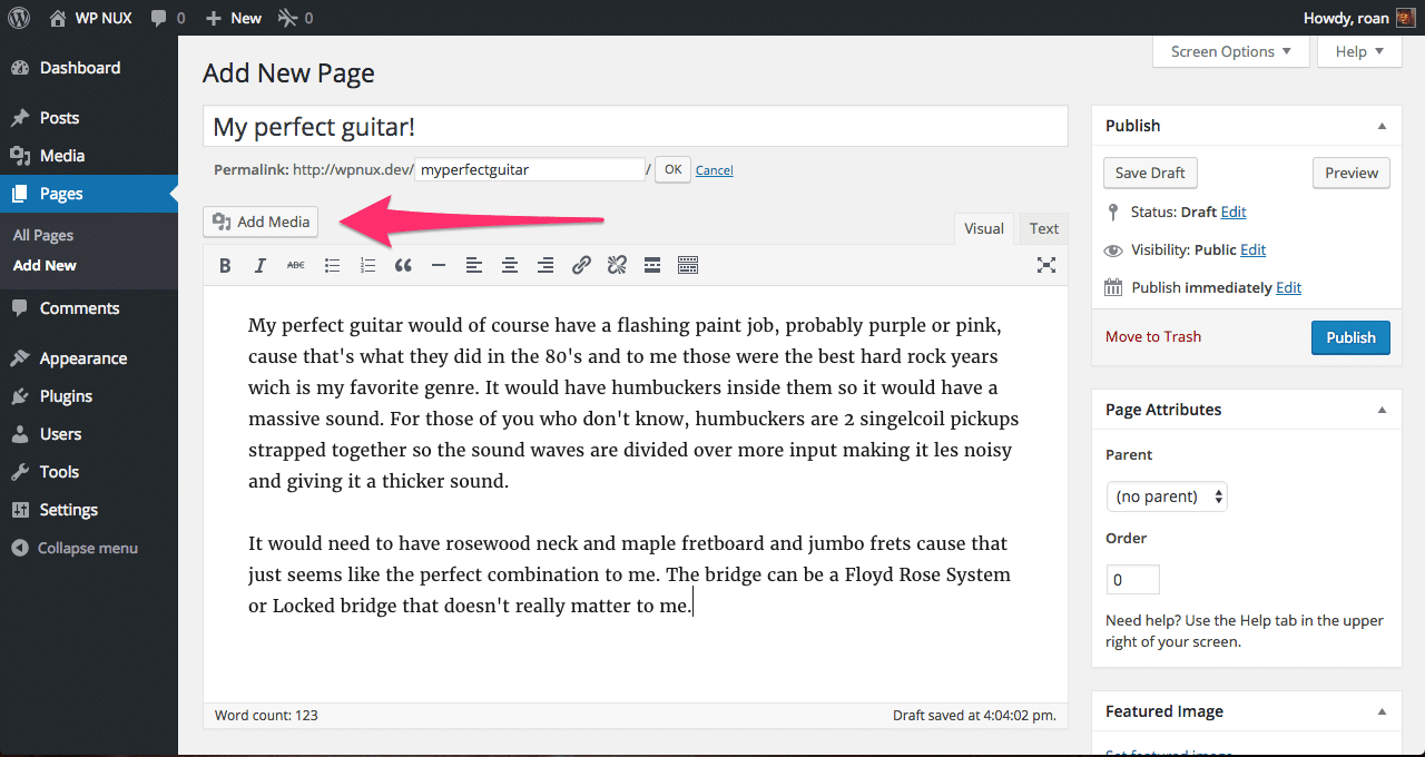
When the page reloads I can then start to write some text. Obviously it had to be about my favorite guitar 😉
Before I start typing in the editor, I’m going to add a title to the post as mentioned in the task. Next up I start dreaming about the perfect guitar I have in my mind and writing it out. When I’m done outlining all that would go into my perfect guitar, I now have to add two images to the post to illustrate what it would look like. But also because that’s the next task.
Finding the Add media button between the text and the title is pretty straight forward, although when I think of pictures I don’t necessarily think about media, but I assume that’s the button I need to click.
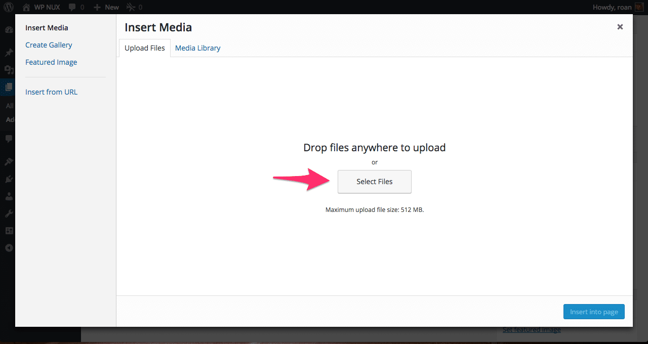
Turns out I’m right. Next, a pop-up appears in where I can choose to select the images where I need them to be. It’s pretty obvious to me that the button select files is the one that I need to click to select the images I want to add. Upon clicking that I can navigate to the folder om my computer to select the images I want and add them.
What’s not so obvious is the screen I’m presented with when the images have uploaded. I’m seeing a lot of options that are not clear in what the implication of choosing one option of the other is. I find this confusing, but since the task is to add to images, I’m going to do just that by inserting them into the page.
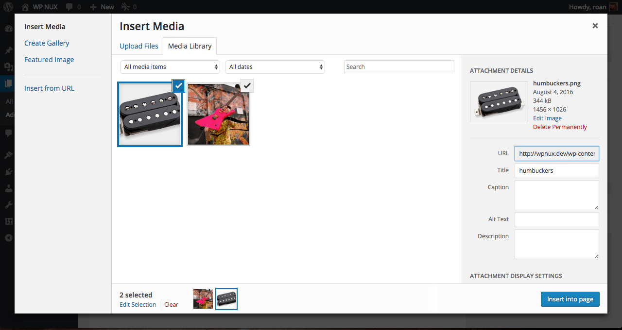
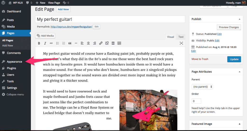
Once I added the images to my post it will look something like the picture below. I of course placed them in a way so they don’t get in the way of the text. This is done by clicking on the image and choosing an alignment.
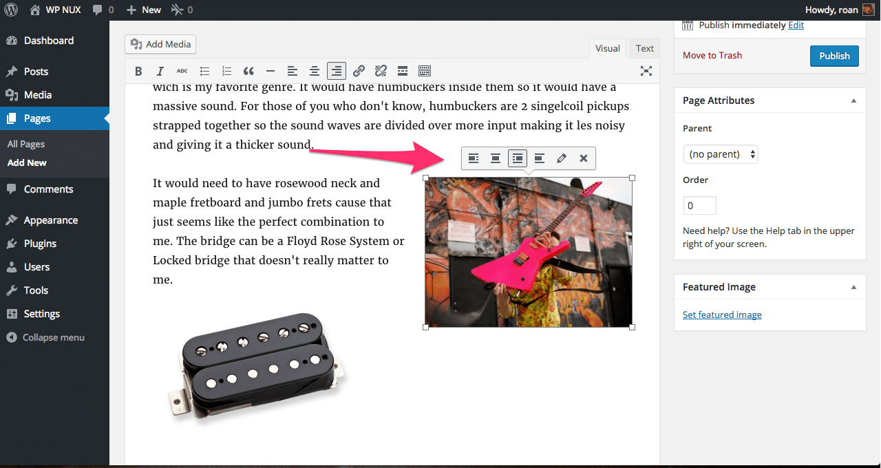
After I did that it looked something like the picture shown above. After that I pressed the publish button shown in the top right corner of the image.